The Client
Sweaty
The Background
Designing a HIIT Fitness App for Wearables
Sweaty, an emerging startup in the fitness space, is preparing to launch its flagship app designed to elevate High-Intensity Interval Training (HIIT) with wearable tech integration. As release approaches, Sweaty has focused on user needs for personalized workouts and real-time health tracking, positioning itself to stand out with its Apple Watch integration and on demand HIIT educational content.
The team at Sweaty approached me to take on the Senior Product Designer role within their team, recognizing my track record of creating user-centric, high-impact designs with an emphasis on simplicity. I took what was only an initial business concept and transformed it into a unified, user-friendly experience, utilizing feedback and insights to guide the design process and ensure that the final product not only met business objectives but also successfully resonated with the growing HIIT community user base.


The Challenge
Elevate Performance through (User) Experience
With growing demand for fitness apps in general, Sweaty aimed to create a niche product that leverages Apple Watch capabilities for real-time heart rate monitoring and other performance metrics. The challenge was to balance advanced features without overwhelming users, catering to both casual and dedicated HIITers.
Additionally, the app needed to support multiple levels of engagement, from casual users to dedicated, while incorporating a revenue-generating freemium model that could scale post-launch.
Key questions/objectives included:
- How to best leverage wearable tech to enhance performance?
- What UI/UX designs ensure an intuitive experience for various fitness levels?
- How to create an enticing premium offering while maintaining core functionality for free users?
Additional Thoughts: Interviews with over 50 potential users revealed challenges with existing apps. Users expressed a desire for adaptable experiences that provide real-time feedback specific to HIIT workout routines. We also identified the core problem: users we seeking detailed performance data presented in a simple interface.
Exploration
Innovating One Rep At A Time
During the exploration phase, we conducted thorough user testing through private beta versions of the app, gathering feedback from early adopters and HIIT enthusiasts. This feedback was integral to refining key features like user stat customization, real-time health feedback, on demand training and the Apple Watch integration aspects.
Key areas:
- Wearable Tech Integration: Focused on delivering real-time data through the Apple Watch, monitoring heart rates, blood oxygen, and providing haptic feedback at key moments during an acitive session.
- UI/UX for Multiscreen Experience: Ensured a seamless experience between phone and watch screens, making key metrics easily accessible.
- Customization: Explored user-friendly ways to adapt workouts to individual skill levels and goals.
- Freemium Model: Evaluated pricing strategies for core features while enticing users to upgrade.
Additional Thoughts: Brainstorming led to balancing a sleek interface with advanced features like heart rate tracking and workout customization.
Deep Thinking: UX Strategy & Design Decisions
Understanding User Behavior & Workout (HIIT) Mental Models
HIIT users follow an intense, fast-paced training structure, meaning every second of interaction matters. A major challenge was balancing detailed performance data with an uninterrupted workout experience.
To solve this, I mapped out key workout mental models through user interviews and behavioral analysis, uncovering the following insights:
- Experienced HIIT users prioritize real-time biofeedback (heart rate zones, fatigue levels) but don’t want to interact much during sessions.
- Casual users need more guided feedback but get overwhelmed by too much data.
- All users prefer quick post-workout insights, but customization should be effortless, not mandatory before each session.
These findings directly shaped interaction patterns, UI hierarchy, and feedback mechanisms to ensure both beginner and advanced users felt in control.
Journey Mapping & Optimizing the Multiscreen Experience
A key UX challenge was designing a seamless experience between Apple Watch and iPhone, ensuring intuitive cross-device continuity.
I developed user journey maps that analyzed:
- 1. Pre-Workout Setup – How users choose a workout, adjust settings, and preview stats.
- 2. In-Session Experience – How they interact with real-time data, receive haptic/audio feedback, and make adjustments without breaking focus.
- 3. Post-Workout Review – How results are presented to encourage habit-building and promote premium features.
Through these journeys, I identified friction points and streamlined them by:
- Minimizing mid-workout interruptions → Ensuring haptic and audio cues replaced unnecessary on-screen interactions.
- Creating intuitive workout transitions → Automatic adjustments based on real-time heart rate and fatigue levels.
- Enhancing post-session flow → Instant, digestible insights + one-tap access to deeper performance analytics.
This approach ensured that Sweaty didn’t just track workouts but actively enhanced performance, setting it apart from competitors.
Designing for Focus: UI, Data Visualization & Interaction Patterns
Given the intense, distraction-free nature of HIIT training, I had to design data-heavy screens that were readable at a glance, especially on the Apple Watch.
Key design optimizations:
- Prioritization of Key Metrics – Users could customize which stats were most visible, avoiding information overload.
- Color-Coded Heart Rate Zones – Users could instantly gauge exertion without reading numbers.
- Haptic & Audio Cues – Instead of checking screens, users received subtle vibrations or voice cues when heart rate zones changed.
- Adaptive UI Scaling – Ensured clarity under different lighting conditions and screen sizes, crucial for workouts indoors and outdoors.
Each decision was grounded in cognitive load reduction principles, allowing users to stay engaged with their workout, not their screen.
Freemium Model & UX-Driven Retention Strategies
Because Sweaty’s business success depended on premium conversions, UX design wasn’t just about usability—it had to drive engagement and retention.
To encourage upgrades without disrupting free users, I employed these UX strategies:
- Frictionless Upgrade Flow – Users could unlock premium features at moments of peak motivation (e.g., after seeing progress data).
- Gamification & Habit Loops – Progress tracking, streaks, and adaptive recommendations made users more likely to stay engaged.
- Tiered Data Access – Free users received basic metrics, while premium users unlocked advanced analytics, providing clear value without forcing an upgrade.
This UX-first approach to monetization ensured that premium adoption felt natural, not forced—a key factor in long-term retention and revenue growth.
Strategy
Building a Seamless Path to Success
Our design strategy focused on ensuring that Sweaty would be ready for a successful launch, prioritizing a seamless user experience, instinctual controls, and clear differentiation in the fitness market. With the data gathered from our beta testers, we optimized every feature for the official release.
- Personalization Through Data: Users can customize HIIT programs based on intensity, duration, and goals, with real-time adjustments to prevent overtraining.
- Seamless Apple Watch Integration: Heart rate monitoring and feedback enhance the workout experience, with vital metrics accessible on both devices.
- Freemium-to-Premium Pipeline: A freemium model offers essential features to all users, while premium users gain access to advanced metrics and exclusive content, encouraging smooth upgrades.
- Cross-device Consistency: We ensured a cohesive experience across iPhone and Apple Watch, maintaining design and user flow consistency.
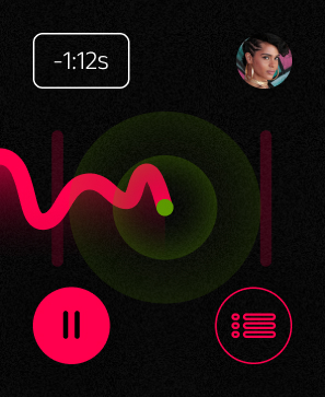
Additional Thoughts: One key concept I developed was to allow input on the Apple Watch while simultaneously utilizing the phone as a type of heads up display for stats and greater control. I developed prototypes for user testing and iterated on the UX as well as the UI elements/components to deliver an optimal session experience.
.jpg)
 (Horizontal).jpg)
Results / Outcome
Anticipating Impact: The Future of Sweaty
As Sweaty prepares for its official launch, we anticipate a strong reception based on extensive beta testing, market research, and industry trends in both the HIIT and wearable tech spaces.
- User Engagement & Growth: Initial projections include 35,000 to 55,000 downloads in the first three months, with users likely completing workouts 2-3 times per week as indicated by private beta users and research.
- Premium Conversion: We estimate 10-20% of free users will upgrade to premium within 60 days, driven by the HIIT specific Apple Watch integration, personalization features and trial offers.
- Retention & User Loyalty: Strong retention is anticipated, with rates similar to existing fitness apps, bolstered by comprehensive features and broad platform integration.
- Market Positioning: Sweaty is poised to capture a significant portion of the growing wearable fitness app market, projected to expand at a 25% CAGR over the next five years.
- Product Launch Success: With a strategic marketing approach, including partnerships and targeted campaigns, Sweaty anticipates a successful launch and strong engagement especially within the growing HIIT community.
Additional Thoughts: Beta testing refined the UX and UI, addressing inital pain points like navigation and metrics display, ensuring actionable data during workouts. Data will shape future iterations and set the stage for more complex/advanced features and interations.
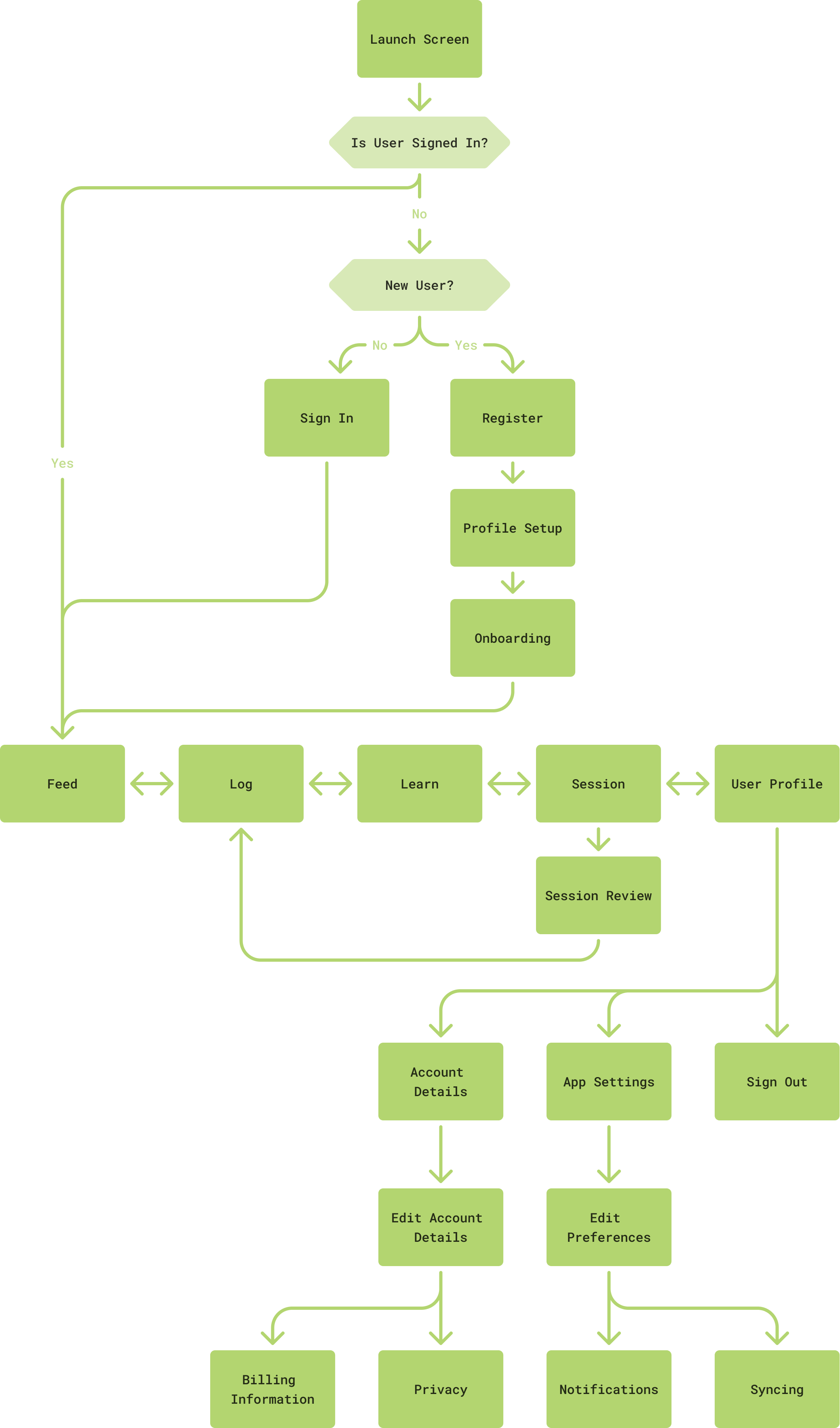
Key points on app map above
- The main navigation provides constant access to all the major features. Main navigation: Feed, Log, Learn, Session and Profile.
- After signing in, users land on the Feed and access to the main navigation, where they can jump between any lateral screens.
- Any content actions (like starting a session or watching a lesson) flow naturally into the Session screen.
- The Session Review screen feeds into the Log screen so users can review or repeat sessions.